Sep 23, 2026
Responsive Website Review: How to Check Every Screen Size
Hussain Abdullah
Head of Product6 min read
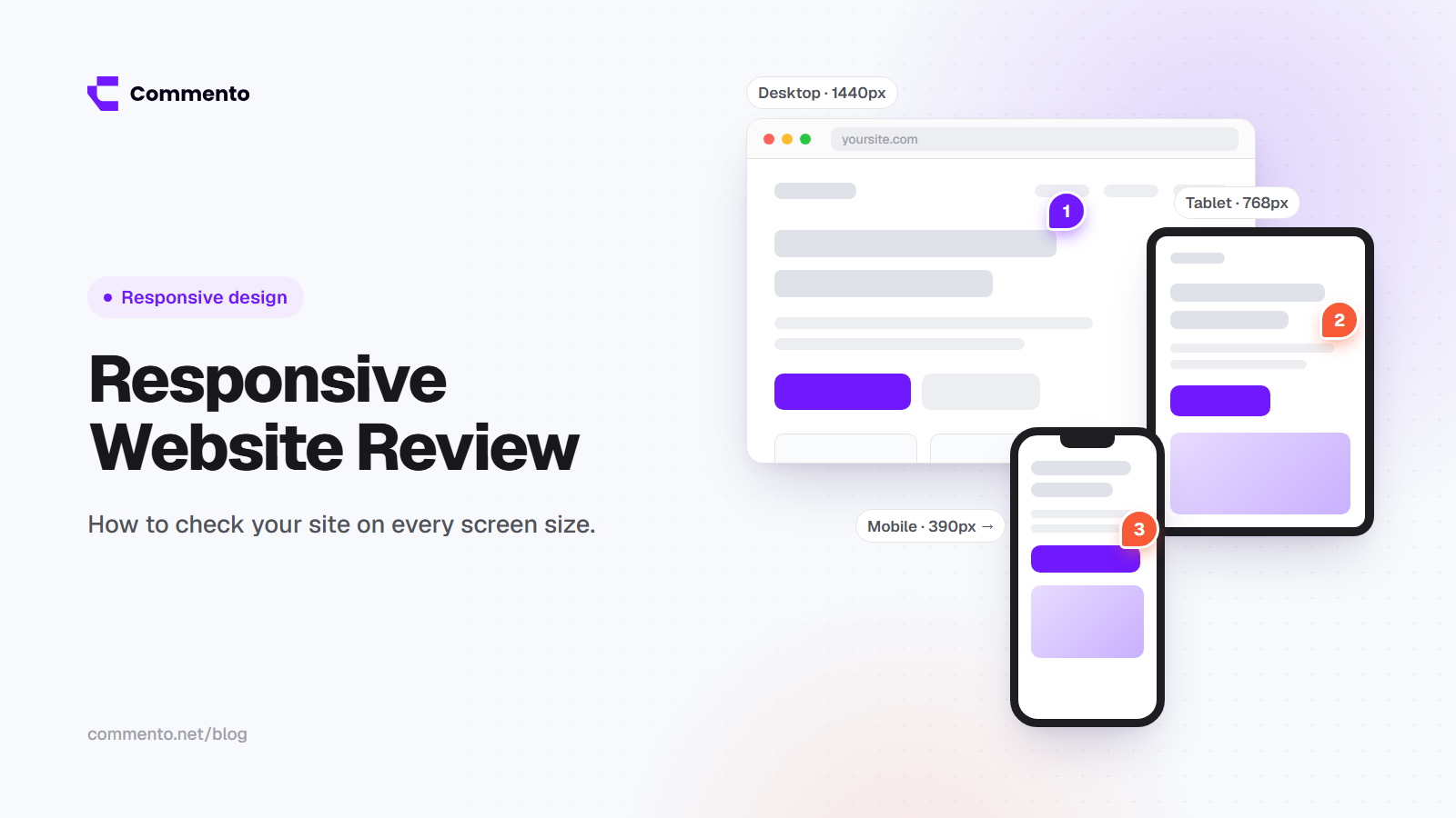
Most people build and review websites on a laptop. Most visitors see them on a phone. That gap is where layout bugs hide: text that overflows, buttons that are too small to tap, menus that do not open and images that get cut in half.
A responsive website review is a check of how your site looks and works across different screen sizes. This guide shows you which sizes to test, what to look for on each one and how to report problems so they get fixed quickly.
What is a responsive website review?
A responsive website is one that changes its layout to fit the screen it is shown on. A responsive website review checks that those changes actually work. You look at each important page on small phones, large phones, tablets, laptops and big desktop screens, and you note anything that looks broken or is hard to use.
It is part design check and part website critique, and you can do most of it with your browser and a simple website review tool. You are not only asking "does it fit?" but also "is it still easy to read and use?"
Which screen sizes should you test?
There are thousands of devices, so you cannot test them all. The good news is that you do not need to. Testing a handful of common widths catches most problems. A practical set looks like this:
360 pixels wide: smaller and budget Android phones
390 to 430 pixels wide: most current iPhones and larger Android phones
768 pixels wide: tablets held upright
1024 pixels wide: tablets held sideways and small laptops
1280 to 1440 pixels wide: most laptops
1920 pixels wide: large desktop monitors
Also check your own analytics. If a big share of your visitors use one particular device or screen size, add it to your list.
Do not forget the in between sizes. Slowly drag your browser window from wide to narrow and watch the layout change. Many bugs only show up at widths no one thought to test.
Where to test
Browser developer tools
Chrome, Firefox, Safari and Edge all have a device mode in their developer tools. It lets you switch between screen sizes in seconds. This is the fastest way to start and it costs nothing.
Real phones and tablets
Device mode is a good start but it is not the same as a real phone. Touch, scrolling, font rendering and the on screen keyboard all behave differently on real hardware. No amount of desktop checking replaces real mobile website testing, so test on at least one real iPhone and one real Android phone before launch.
Cloud device testing services
Services like BrowserStack and LambdaTest let you open your site on many real devices and browsers from your computer. They are useful when you need to check a wide range of devices without owning them.
What to check on every screen size
Layout
Nothing spills off the side of the screen or causes sideways scrolling
Columns stack in a sensible order on small screens
Spacing looks even and nothing overlaps
Text
Body text is easy to read without zooming
Headings do not break into awkward single words on each line
Long words, links and email addresses do not overflow their boxes
Navigation
The mobile menu opens, closes and scrolls properly
Every menu link works on every screen size
Sticky headers do not cover too much of a small screen
Buttons and links
Buttons are big enough to tap with a thumb
Links are not packed so close together that people tap the wrong one
Hover effects have a touch friendly version, since phones have no hover
Images and video
Images scale down without being cropped in a bad place
Text inside images is still readable on a phone
Videos fit the screen and do not autoplay with sound
Forms
Fields are full width and easy to tap
The right keyboard appears, such as a number pad for phone numbers
Error messages are visible and not hidden behind the keyboard
Tables, popups and banners
Wide tables scroll inside their own box instead of breaking the page
Popups can be closed easily on a small screen
Cookie banners do not cover the whole page
Rotation and zoom
Turn the phone sideways and check again
Zoom the page to 200% on desktop and make sure content still works
Zoom and screen size also matter for accessibility. Our website accessibility review checklist covers this in more detail.
A simple process for a responsive review
Pick your key pages. Homepage, main service or product pages, pricing, contact, one blog post and any form or checkout page.
Pick your screen sizes. Use the list above plus anything your analytics shows.
Review one size at a time. Go through all key pages on a phone first, then tablet, then desktop. It is easier to spot patterns this way.
Record each problem with its screen size. A layout bug is useless to a developer if they do not know where it happens.
Fix, then check again. A fix for mobile can sometimes break tablet or desktop, so recheck the other sizes.
How to report responsive issues clearly
The most common problem with responsive feedback is missing details. "The menu is broken on mobile" leaves the developer asking: which phone, which browser, which page, broken how?
Every responsive issue should include:
The page URL
The screen width or device
The browser and operating system
What you see and what you expected
A screenshot or, even better, a comment pinned to the element
This is where good web review tools help. A website design review tool that records screen details for you is much easier than keeping notes in a spreadsheet. With Commento, you pin a comment on the live page and the browser, device and screen size are recorded for you. Nobody has to remember to write them down.
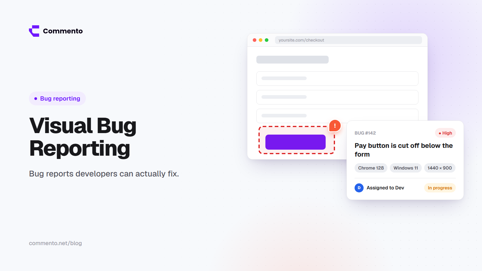
For more on writing reports developers can act on, see our guide to visual bug reporting.
Common responsive problems to watch for
Fixed widths that force sideways scrolling on phones
Large hero images that push all the content below the first screen
Font sizes that are too small on mobile or too large on big monitors
Buttons placed side by side that become too narrow on small screens
Menus that work on click but not on tap
Final thoughts
A responsive website review does not have to take days. Pick your key pages, test a small set of screen sizes, check real devices before launch and report every issue with its screen size attached. Make it part of your website QA checklist so it happens before every launch, not after complaints come in.
If you want your team and clients to report layout issues with the screen details included, try Commento on your next review.